Eager to add my own two cents to the hype surrounding wearable fitness trackers, I got hold of two front-running devices on the SA market: the Fitbit Charge HR* and the Jawbone UP3*. Both take the form of slick electronic wristbands which monitor the user's heart rate, exercise and sleep cycles, pairing with an app on the user's smartphone to present the data they collect. Both retail at around R2 400 at various electronics, sports and online stores across SA.
I used each fitness tracker for one week in order to compare the two, and this is what I found.
Look and feel
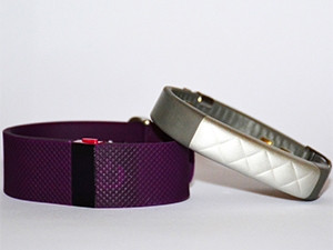
Jawbone wins hands-down where comfort and style are concerned. Its minimal design - modelled on the charity rubber wristbands popular in the late 2000s - renders it about half the width of the Charge HR, and twice as chic. Its metal face is embossed with a simple diamond or liquorice twist pattern, and users can choose from a handful of neutral, sophisticated colours - including black, grey, navy, and white-and-gold - so it blends in almost unnoticeably with formal, casual, or sportswear: ideal for its intended 24/7 use.
The Fitbit Charge HR, by comparison, is clumsy and clunky: the band is wide and its all-rubber (or "elastomer", to be precise) surface and range of jewel-bright colours (black being the only neutral option) make it goofily stick out as sportswear, rather than nonchalantly blending into everyday contexts or special occasions.
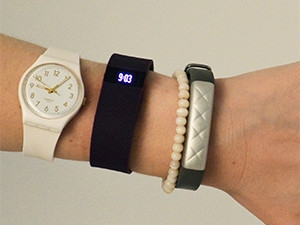
The Charge HR is also uncomfortable: worn in an unusual place on the forearm (a finger's width above the wrist bone), it consistently left irritating indents in my skin (yes, I tried loosening it), and once I even woke up with a rash underneath the device.
The UP3, on the other hand, feels as unobtrusive as it looks, sitting naturally at the base of the wrist.
Both, unfortunately, are a fiddly nightmare to put on and take off. This is a consistent bother as neither device is waterproof, so one has to remove them at least once a day to bath (the UP3 can apparently be worn in the shower), or wash the dishes. (To those who do water sports, these devices are useless.)
Usability
The main differences between the Charge HR and the UP3 in terms of usability are that the Charge HR is fitted with a tiny monochrome screen for checking the time or glancing at data on the go, whereas the UP3 syncs much more seamlessly with its smartphone app.
The Charge HR's tiny screen has a clever knack for picking up when I tilt my wrist to check the time, and lighting up accordingly. By tapping the screen or pressing the tiny button next to it, I can flick through shallow data, such as my current heartrate and how many steps I have taken today.
While this is handy, the immediacy of this feature meant I hardly bothered to look at the longer-term analytics the device offers via my smartphone, so I ended up spending my time absorbing random bits of data rather than the insightful graphs these devices are designed to deliver.
The UP3, on the other hand, has no screen, and hence checking one's data means opening the app and interacting with a lot more contextual information. The UP3 also syncs with its app almost instantaneously, so checking this data was relatively quick and painless. By comparison, the Charge HR took a laboriously long time to sync, which added an extra deterrent to checking my longer-term analytics.
It is also worth mentioning that the UP3 is far more "plug and play" than the Charge HR. Download the UP app, pass through some prompts and you're done, whereas the Charge HR's initial syncing and e-mail verification processes are littered with errors and waiting time.
Analytics
The UP3 and Charge HR not only measure heart rate differently (the UP3 with metal pads on the user's pulse points, and the Charge HR with green LED lights which shine onto the skin to detect blood volume changes) but seem to measure different heart rates.

While both devices offered me believable heart rate graphs, the Charge HR seemed to pick up a consistently higher heart rate, leaving me suspicious that one (or both) of these devices is inaccurate, but uncertain as to which one.
In addition to heartrate, neither device's measuring of exercise (which it counts in steps, encouraging me to take 10 000 each day) seems on point. According to both the Charge HR and the UP3, a 75-minute ballet class is about equivalent in steps to a morning of sitting at my desk, which doesn't seem right - at least, last time either device checked, my heart rate doesn't top 200 beats per minute (bpm) while I'm responding to e-mails.
Speaking of active heart rate, the UP3 doesn't measure it. Only the Charge HR provides heart rate analytics during exercise, and its design is more fitted to this purpose too, as one can easily check these readings at various points in a workout by simply tapping its in-built screen a few times.
Bad
Data gaps and inaccuracies aside, I am unsure of the health advice these devices push. Both tell me that the aforementioned ballet class makes up under a quarter of their recommended daily exercise, which makes me wonder how long and how intensely one would have to move about to reach those 10 000 steps a day - and who has the time and energy to manage this commitment, besides professional athletes and people who spend all day on their feet. Most doctors advise doing at least 30 minutes of physical activity per day, but this is not nearly enough for the UP3 or Charge HR.
More worryingly, an oversight (I hope) in the UP app's food-tracker - which gives users a score out of ten based on the number and types of calories they have consumed each day - means that if I eat one good meal but forget or don't have time to log the rest (a prohibitively laborious process), I can maintain a 10/10 food score for a day on which I have (by the app's knowledge) consumed as little as 100 calories.
Given the strong (however well-concealed) presence of eating disorders such as anorexia within health and fitness culture, this is problematic. Many food-tracking apps remind users to consume at least 1 200 calories per day (1 800 for men) in order to avoid starvation and maintain good health. The UP app's failure to do so reflects the often damaging "health" ideals that are so rife in diet culture.
On this note, I wonder if the recommended "minimum" of 10 000 steps will not act for some as a tacit encouragement to over exercise.
Conclusion
Would I pay R2 400 for either of these fitness trackers? No. It seems wearable fitness trackers such as these are still new to the mainstream market and have some kinks that need ironing out - such as the accuracy of their exercise tracking, and the fact that neither device is waterproof - before they will seem worth it to me.
If I had to choose between these devices, though, I would go with the UP3. While its failure to measure active heart rate is a major flaw, it is much more pleasing to use than the Charge HR. The UP3 is more attractive and comfortable to wear, and its lack of an in-built screen encourages me to access my data in context rather than in isolation. The device's quick syncing with my phone also makes this a relatively hassle-free process.
*Review devices supplied by DionWired
Share