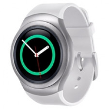
The smartwatch industry is going through a rough time. Although small brands like Pebble are successful in their own way, bigger players like Samsung are still struggling. Will the new Gear S2 be its much-desired breakthrough product?
Not many people might know this, but Samsung has been fiddling around with smartwatches since 1999. Nonetheless, they still haven't been very successful. Even Apple hasn't been able to convince the mainstream public to go and buy a smartwatch, so you know there's still a long way to go.
There is a silver lining though. After all these years of prototyping and experimenting with numerous form factors, shapes and software versions, Samsung might finally have gained a deeper understanding of what makes a great smartwatch. The result is the new Galaxy Gear S2.
Look and feel: minimalistic
One of the first things you can accuse the Samsung Galaxy Gear S2 of is that it definitely doesn't look like a smartwatch. True watch fanatics will absolutely love its minimalistic appearance. The Gear S2 perfectly covers up all that makes it smart by using a round design and subtle dimensions. Sure, Motorola's Moto 360 and LG's G Watch R were also round, but considerably bigger and thicker than this new Samsung watch. In the end, the S2 is both smaller and thinner than any other circle-shaped smartwatch currently out there.
The rest of its design is equally subtle, which really differentiates the Gear S2 from other devices. The watch simply doesn't have big wheels or knobs, or a lot of detail in the watch case for that matter. The S2 doesn't even feature a mixture of different materials. There's just some shades of grey, a smooth finish and two small buttons on the side.
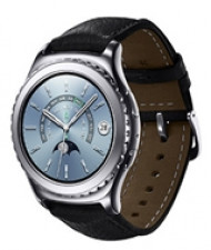
This minimalistic approach doesn't completely apply to the R900 more expensive classic version of the S2, which displays some more details in the watch case and comes with a leather band. The classic version also supports standard watch bands, the regular S2 disappointingly does not. Both models come with an IP-68 rating, meaning that in theory they're completely dust-tight and won't break after they come in contact with water.
One of the most eye-catching properties that give the S2 its elegant look is the beautiful amoled screen. The display is able to deliver stunning contrast and very deep levels of black. Just like with a traditional watch, the digital watch face is slightly absorbed into the casing itself. I usually like it when the screen sits right on top of the device, but the Gear S2's recessed screen really adds a nice touch to the whole product. From a pure functional point of view, the slightly absorbed screen doesn't suffer from pesky reflections.
Hardware and battery: can't complain
The Gear S2 smartwatch runs on an Exynos 3250 dual-core SoC that houses two 1 GHz Cortex A7-cores. When compared to the modern hardware found in smartphones, these specs obviously pale. Still, the SoC proved more than capable to get everything working smooth and fast. In addition, the S2 also features Bluetooth 4.1, WiFi and NFC support. For more details and specifications, take a look here.
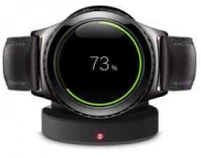
Like the 42mm Apple Watch, the Gear S2 also houses a 250mAh capacity. From that capacity, however, Samsung has managed to squeeze out much actual battery life. During my review period with the Gear S2, it easily lasted for one and a half days when used for typical office-related tasks. I'm sure that if you turned the device off during the night, it would probably last for two days. When compared to the Pebble smartwatch, which uses a completely different screen technology and therefore lasts for up to seven days, the S2's battery life pales. However, when compared to other modern smartwatches like the Apple Watch, a two-day battery life is a good score.
Interface: a nice twist
The circular shape isn't just a fashion statement, on the contrary, it represents Samsung's new philosophy on how to operate the Gear S2. Many modern-day smartwatches use touchscreen technology, or buttons, to interface with the wearer. Samsung now adds a third method, turning the bezel, to scroll through long e-mails, zoom in on a map or skip a track during music playback. The S2's touchscreen, however, can still be used to tap on items while the two buttons on the side quickly return you to the home, or previous, screen.
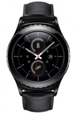
To be honest, the use of a turnable bezel is pure genius. This new approach works extremely well and I won't be surprised when competing brands copy it to their new models soon. It is one of the freshest and intuitive ways to control a watch I've experienced in a long time. Just like when Apple introduced their multi-touch technology, and it felt easy and intuitive right from the start, so does using this bezel.
I also have to credit Samsung for the actual implementation of the bezel, which is what ultimately makes it so great to use. The ring itself gives you exactly the right amount of physical feedback and counter pressure. In addition, it produces subtle clicking sounds, facilitating extremely fine and precise input.
On top of that the software is very responsive, further enhancing the direct relation between turning the bezel and seeing the result on-screen. In short, the bezel makes the S2 very pleasant to work with.
Tizen: intuitive, but limited
Samsung's decision to introduce a completely new way to operate a smartwatch inherently meant they couldn't just use the Android Wear operating system. Google simply doesn't allow manufacturers to make such drastic changes to their system, like using a bezel to navigate. Good thing Samsung still had its own Linux kernel-based Tizen mobile operating system available, which just needed some dusting off.
Basic functionality of the Gear S2 is similar to that of other smartwatches. It tells the time, displays notifications from your phone, runs apps and houses a few fitness features. However, to further manage and configure the S2 in detail, you need to install an Android-only app on your paired phone. This app can additionally be used to install new apps and configure notification preferences.
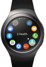
The installed version of Samsung's own Tizen mobile operating system is completely customised to meet the Gear S2's bezel-based navigation. Its main interface, for instance, consists out of various round pages that are set-up in a sort of virtual circle, with the clock being the default screen. By turning the physical bezel, you'll also navigate through this virtual circle.
Turning the bezel to the left from the clock as a starting point will bring you to the notifications. If you turn it to the right, you'll end up at all of the settings and apps. Turning the bezel even further will bring you to the fitness functionality, the weather, calendar and the music player. All of these pages and options are fully customisable and can be arranged in any way you like.
By tapping the app icon, you'll dive deeper into the Tizen interface where all of the apps are arranged in another circle. In essence, that is how the whole interface works: use the physical ring to navigate and touch the screen to go one level deeper. In addition, the lower button on the right side of the S2 will immediately bring you back to the home screen while the top button will back you up to the previous screen. Of all the smartwatches I've worked and played with over the last couple of months, the S2 offers the best way to operate and control it, hands down.
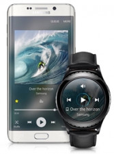
Samsung's choice for the Tizen operating system does come with some consequences, though. The number of apps available for the Tizen platform pales compared to what's available for the Apple Watch- and Android Wear-based watches. Furthermore, the integration of popular apps like WhatsApp, Telegram and Google Maps is scanty. You can read notifications, and sometimes respond to them, but that's just about it. Also, Google Now integration like with Android Wear, won't work.
Not many developers are currently inclined to pour loads of time, energy and resources into smartwatch apps. And even if they do, it will be for the Apple Watch or Android Wear devices. Samsung must have anticipated this issue and therefore already included maximum functionality in the watch itself. The S2 has a built-in step counter, heartrate monitor, stopwatch, music player, weather app, calendar, mail app, calling functionality, text-app and a photo gallery. Some of these apps and functionality, however, only work when the Gear S2 is connected to a specific Samsung phone.
Final verdict
In Summary
Pros: Intuitive controls, subtle design, great screen, loads of built-in functionality, good battery life
Cons: Limited app ecosystem and Google integration
Rating: 7.5/10
Price: R4 599, R5 499 for S2 Classic
Availability: Now
Product page: http://www.samsung.com/za/galaxy/gear-s2/features/
Of all the smartwatches Samsung has ever produced, this Gear S2 is the best one. It features a well-devised, subtle design, great amoled screen and extremely intuitive controls as a result of the innovative bezel. It's also great that the classic version supports standard watch bands, but equally disappointing the regular Gear S2 does not.
Unfortunately, the S2's biggest issue lies not in its hardware, but the software. Even though the Tizen operating system has come a long way, the current lack of app support and general integration with Google services is problematic. The only way that might ever change, is when app-developers turn their focus to the Tizen platform on a large scale. Personally, I don't see that happening any time soon.

