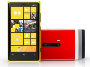
The Lumia 920 is Nokia's third and most compelling effort at really getting back into the smartphone big-leagues. It also happens to be one of the flagship devices for the new Windows Phone 8 operating system.
Holding the device for the first time, I couldn't help but feel like it was, in some ways, a throw-back to the Nokia devices of my pre-teens - those really sturdy, solid devices that could be used as a weapon for self-defence if need be. Obviously, the 920 is leaps and bounds ahead of the likes of the good 'ol 3310 - but compared to some of the other smartphones currently dominating the market, there's no escaping the fact that this handset is quite hefty.
While I'm not sure if I'm entirely sold on the yellow colour of my review handset, I do like the fact that Nokia (and HTC for that matter) are bringing bright colours back to handset designs. Enough with the boring black and grey rectangles, I say.
Despite being somewhat intimidated by the size, it was actually surprisingly comfortable in-hand, and I got used to it fairly quickly. The smooth, sleek, polycarbonate body and the curved gorilla glass finish, make it a pleasure to hold and interact with. The 4.5-inch Clear Black, Pure Motion HD display (332 ppi) is also exceptionally crisp and bright.
However, the reaction from my friends when seeing the Lumia for the first time was something along the lines of 'Is that an external hard drive?' or 'What are you doing with a yellow brick?' While some of them changed their tune after interacting with it, others remained resolute in their disdain. Despite my attempts to regale them with the 920's features, their reactions were indicative of the broader challenge Nokia (and Microsoft for that matter) face in terms of redefining the brand and shaking off the cobwebs.
Windows Phone 8
Before getting to the unique features Nokia brings to the device, let's first look at the Windows Phone 8 operating system and user interface. The new OS has been positioned as the antithesis to the bland, static rows of app icons we've been seeing in smartphone interfaces for the last half a decade.

The homescreen consists of Live Tiles, which can be dragged and dropped, rearranged and resized (with three different size options). There are also various colour schemes to choose from - making it far more customisable than most platforms. It's refreshingly different, and I found it fairly simple to navigate.
A key element to bringing the OS to life and making it more personal is the People Hub - which syncs all of one's social feeds (Facebook, Twitter and LinkedIn) and pulls them into a single newsfeed. You can interact with these updates directly from the unified newsfeed, without needing to launch the individual apps. Of course, a newsfeed of all your newsfeeds can get quite 'noisy', so thankfully there is the option to filter it by specific accounts. The People Hub also syncs all contacts from across the user's different accounts to create a single contact list.
A small annoyance, however, was the fact that in order to create a new contact, I always had to create it within one of my synced accounts - there was simply no option to save a contact to the phone or the SIM. Or if there was, it was certainly far more difficult to find than it should have been.

A specially designed Facebook for Windows Phone app reflects the same basic design as the OS, and can be customised with banner images. The app also allows for the customisation of the lockscreen with images from the user's Facebook albums - which adds a nice touch, but I would prefer if there were more options for choosing specific images rather than relying on the app to randomly choose based on very broad criteria (such as specific albums, or just 'Pictures of me'). Not knowing exactly which pictures your phone is going to surface at what time is not ideal for those with some less than flattering images floating around on their Facebook.
Speaking of apps though, the relative lack of apps compared to other platforms like iOS and Android is of course widely considered to be the Achilles Heel of Windows Phone 8. To be fair, the majority of top apps are available in the Marketplace (Microsoft says 46 out of 50). But app junkies will no doubt feel restricted by the relatively limited options at this point. Hipsters, who have to Instagram their food before eating it, will likely starve.
In summary
The Lumia 920 a definite step up for Nokia, and for the Windows Phone platform. It's fast, responsive and offers a smooth, dynamic user experience - provided you can get past its size. The camera is exceptional, but some of the other features are still more gimmicky than game changing. Pros: Great camera, vivid display, LTE-capable Cons: Heftier than most smartphones, limited apps, bugs with Windows Phone 8 Price: R399pm x24 on Vodacom Smart Standard 229 contract, with bundled wireless charger Display: 4.5-inch PureMotion HD+ display; 1 280x768 pixels, 332 ppi LTE, NFC: Yes Processor: 1.5GHz dual-core Qualcomm Snapdragon S4 Dimensions and weight: 130.3 x 70.8 x 10.7 mm, 185g Cameras: 8.7MP rear (3264 x 2448 pixels, 1080p video, Carl Zeiss optics, optical image stabilisation); 1.3MP front (720p video) Memory: 32GB; 1GB RAM Battery: 2 000mAh, embedded. 10 hours 3G talk-time Bluetooth: Bluetooth 3.1 SIM: Micro-SIM Extras: Wireless charging, Dolby Audio, Nokia Drive, Nokia Music, PureView Colours: Red, yellow, black, white, gray
I did find myself getting somewhat frustrated when I couldn't easily do the things I am used to doing on Facebook on my phone. Just seeing the details of who actually liked an image I posted proved to be somewhat challenging. The basic navigation icons (Friend requests, Messages and Notifications) were also not very responsive. With the handset being centred on the social experience, I found that aspect fairly disappointing. I kept wanting to grab my iPhone or laptop to be able to get a normal view of what was actually going on on Facebook (yes, I'm addicted. It's part of my everyday life, so the experience has to be up to scratch).
Back to the Live Tiles though - the whole concept is about bringing the homescreen to life, and while the moving images and animations do add an extra dimension, I think the apps still have some work to do in terms of actual usefulness.
Of course, for some of them, it depends entirely on how big you allow the icon to be on the homescreen, but I expected more from them on the whole - more than just the occasionally moving picture. For example, the People Hub Live Tile just continuously flicks through friends profile pictures. I'd like to see a feature that allows me to choose certain groups of people that I'd actually like to see status updates from on my homescreen, when they post it. A notification centre is also clearly missing and it should be one of the top priority features for the first update of the OS.
OS issues
Multitasking also confused me. While holding down the back button would bring up all recently opened windows, I was at a loss when it came to closing them without having to backtrack systematically through every window I had opened. At least for most core apps though it does allow for real multitasking, allowing you to pick up where you left off. This is not true for all apps though, and some still relaunch when clicked on via the multitasking window.
Windows Phone 8 offers deep integration with Microsoft's cloud storage service, Skydrive. Attachments, photos and documents can all be automatically saved to the cloud, along with a backup of your settings.
Some small things that bugged me - the 'Me' tile was a bit slow on the uptake when it came to clearing notifications. On more than one occasion, after viewing a notification in Facebook or Twitter, it would still appear in the Me tile. Even after clicking on the notifications, they would still be there on my homescreen. There are few things that irritate me more than being made to think I have a notification, when I really don't.
Another irritation was the Skype for Windows Phone app. I understand that it is well-integrated with the platform, but not allowing me to sign out was taking things a step too far. This may not be a concern to those users who like to always be online and available - but I am not one of those users. While at first I thought I must have been just missing some fairly obvious settings, I checked some online forums and found that I was not alone. The only advice offered in such forums was to use the 'Invisible' setting or to set one's phone on 'Flight Mode' should you not wish to receive Skype calls. I ended up having to uninstall the app.
All in all though, I like the fact that Windows Phone 8 is different. It's refreshing. Yes, it has some bugs, and yes, it needs some polishing, but it's a decent start. The customisability is impressive and the design is bold and striking. It's also an indication of where the smartphone experience is going, and I like it.
Special features
On to the handset and the uniquely Nokia elements. Nokia brings a number of features to the table, the most notable for me being the camera and the Pure View technology. The 8.7MP lens and extra features are a cut above the competition - certainly blew my iPhone 4S out of the water (jury's still out on whether it beats the iPhone 5 though). A feature that I loved was the Cinemograph option, which allows you to take an image and then select a section of it to leave animated. What would the application of such images be? I have no idea. But it has that novelty factor.
The Smart Shoot feature also allows for multiple shots to be taken at once, allowing the user to flip through the images to choose the best picture afterwards (much like the S3's burst mode). The dedicated camera button on the side of the phone also makes it user-friendly.
Something else Nokia is bringing to the table is its location and mapping services, although I was baffled as to why the Drive app needed to be installed from the Marketplace, and why even after that I still needed to download a voice app for the voice navigation - surely these are things that could have and should have come preinstalled?
Regardless, a feature that really impressed me was the augmented reality application, City Lens, which can (surprise!) actually be used locally. You simply hold up the device and it pinpoints places of interest in the camera view finder (you can narrow it down by categories such as hotels, food, points of interest, entertainment, transport and so on) and the distance to that point. If you select a specific point, it opens the navigation app and guides you to it. I can imagine this would prove useful when travelling and exploring new cities. But it still has some room to improve - some have argued that just pinpointing places is something mapping apps already do. So it will be great to see where Nokia goes with this. For now, like Cinemograph, it still has the novelty factor. It's also the first time we're seeing augmented reality apps being shipped out of the box, indicating that it may be shifting into the mainstream space.
In terms of technical specifications, the Lumia 920 is also a powerhouse. With a 1.5GHz dual-core processor, 32GB storage and 1GB RAM, it's fast, responsive and offers a very smooth experience. It can get quite hot though when playing games or streaming video. Its LTE and NFC capabilities also add a bit of a strain on the battery - but can be switched off.
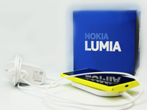
The Lumia 920 can also be wirelessly charged - provided you purchase the necessary wireless charger. I had the opportunity to test it with the FatBoy wireless charging pillow (which Vodacom is currently offering as part of the contract deal for the 920). The charger includes a charging mat/pad (which needs to be plugged in), and a 'pillow' which you can put the charger into and then rest the phone on (the phone can also just go directly on the charger so the pillow is really just for those that like the idea of their phone taking a 'rest'). There is a degree of convenience to being able to just place the phone on the charging mat without having to struggle with cables (provided you already have the charger plugged in that is). But again, I feel like it's just a taste of better technology to come.
Conclusions
With the playing field being fairly even in the high-end smartphone market, the Lumia 920 does well to match its competitors. Despite its credentials though, it has some significant catching up to do. As someone who is potentially on the market for a new phone, the Lumia 920 was a great introduction to the Windows Phone 8 platform, and I enjoyed using it. There's no denying that it is a quality handset. But some of its differentiating features could be considered gimmicky, and not necessarily worth the fairly considerable price tag.
I have no doubt that die-hard Nokia fans that have stuck by the Finnish phone manufacturer will love this handset, and it may well convince a few stragglers from the other platforms to stray. It has a sturdy, quality build, great camera and an exceptional display. Its heftiness will, however, be its downfall for smartphone users who have become accustomed to the slimmer, lighter handsets. App lovers will also most likely want to wait until they know they can find everything they might want in the Windows Marketplace before switching to the platform.
Share